I find most weather sites annoying. They either don’t give you enough information, or they give you too much entirely irrelevant information. (And that’s not even counting the prominent “weather” sites that are about as weather-focused as the History Channel is about history.)
Here’s a few sources I’ve taken to looking at:
Forecast.io
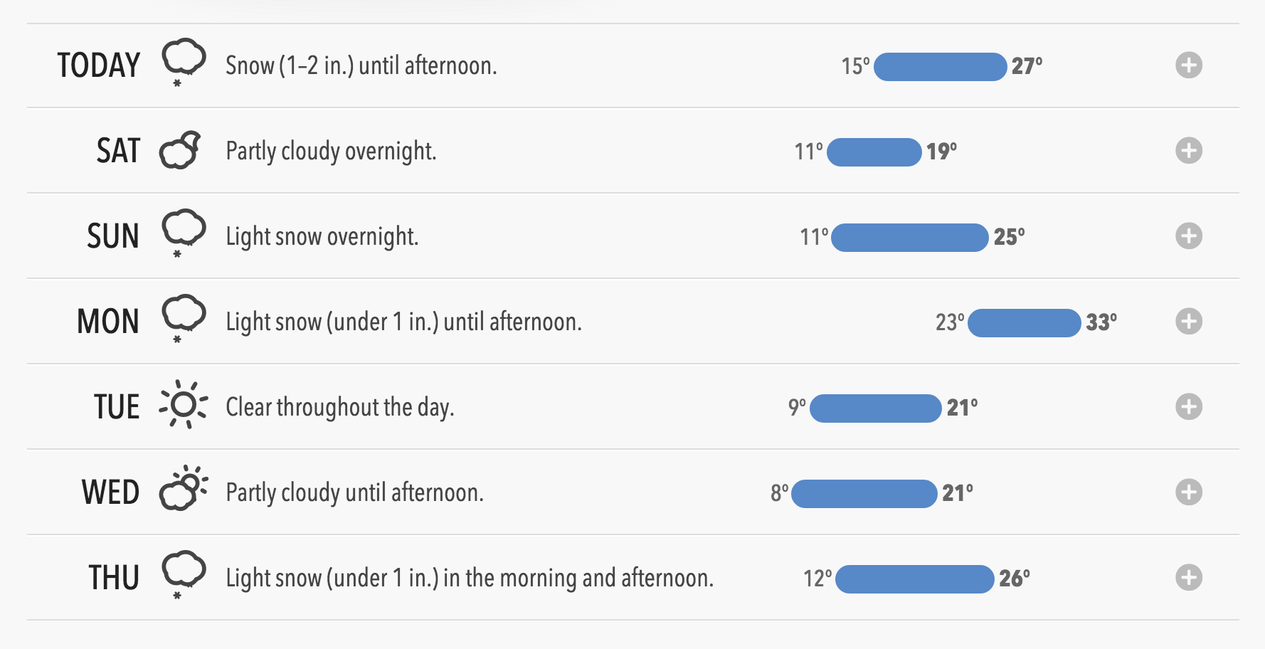
I just discovered this site yesterday. It’s a weather site that doesn’t look like every other weather site. Here’s just part of their forecast:
That’s a fantastic way to represent the weather. And you can drill in for more detail:

And then there’s their Weather Atlas, presenting a (literal!) heatmap of temperatures and precipitation worldwide, in a really neat view. The presentation was so neat that I bought their $3.99 iOS app, Dark Sky.
NetAtmo
I have a NetAtmo weather station at home. I can view the weather outside on my smartphone, whether I’m home or away.
But they also have a weather map with the weather from everyone who’s deployed these. The temperatures do seem a bit variable; I suspect some are installed very close to houses, in the sun, etc.
Weather Wisdom (Boston.com)
Local meteorologist David Epstein has a good blog on boston.com, Weather Wisdom, which is typically updated a few times a week. It’s good for longer-term forecasts, and he strikes a good balance of explaining the variability between forecast models, while neither talking over your head nor making you feel like it’s too dumbed-down.
EMWIN
This is the least user-friendly, by far. EMWIN (Wikipedia overview) is a datastream from the National Weather Service. It includes a whole bunch of their weather ‘products’.
Here’s what they show for KBOX, the Taunton, MA NWS office that covers my area. It’s very non-user-friendly, but I’m not sure that was a design goal. The AFD (Area Forecast Discussion) and AFM (Area Forecast Metric) products are particularly interesting. The AFD is sort of a forecast and a description seemingly meant for meteorologists, and the AFM takes some time to read, but has a lot of information packed into it. There are a lot of other products that are interesting to look at.
It’s the polar opposite of forecast.io—it’s not at all intuitive, but goes very, very deep.
StrikeStar lightning maps
This is far more active in the summer when thunderstorms roll through, but StrikeStar has maps of lightning activity throughout the US, including regional data. It’s powered by people who have deployed Boltek lightning detectors and put them online.
weather.gov
Finally, a reminder that weather.gov exists. It’s not as pretty or easy-to-use as some of the more prominent commercial sites, but they also don’t have “Zoos Worldwide Show Off Adorable New Baby Animals” as a front-page story. They also have an API you can query, though it’s nasty SOAP.