A Little Irony?

This falls into the category of things very few people would notice, but….

Microsoft provides time.windows.com, a public NTP server, operating in stratum 2.

I just came across NTPmonitor, a novel Windows app to monitor a handful of NTP servers. (Sadly, it doesn’t offer the option to sync to any of them, probably because most peoples’ computers let them configure it… Mine syncs to a domain controller which seems to want to give me the time, but not with too much accuracy.)

As with most full-featured NTP clients, it shows you what the remote timeserver reports as its reference clock. I’ve got my server in there, ttwagner.com, showing that it’s currently synced to clock.xmission.com. The “pool” server is pool.ntp.org; whichever of the many machines I connected to is synced to rubidium.broad.mit.edu. On the right we have time.nist.gov, synced to “ACTS,” a NIST protocol.

On the left is time.windows.com, the Microsoft NTP server. Its upstream timeserver?

clock3.redhat.com.

Screenshot attached, since I wouldn’t believe it without one.

time.windows.com gets its time from clock3.redhat.com

Tip o’ the Day

The Web Developer toolbar, which is (1) the #1 hit on Google for “Web Developer,” and (2) now compatible with Firefox 3 beta, is totally awesome. You may recall that, in the past, if you had text after a bulleted list or similar on this page, the text would suddenly be mashed together. I never took the time to fully look into it, but it always irked me.

A quick “Outline… Outline Block Level Elements” drew colored boxes around each element of the page, which was exceptionally helpful. This shows the problem: posts start off inside a <p> tag, and adding a list or similar closes the <p> tag. This would have been an easy catch, except that the list looked fine. Upon a closer review, it’s because the lists specified the same line-spacing, thus looking right. While I most likely could have solved this by staring at the code for a long time, Web Developer made it much easier to spot: the first text is inside one box, followed by the list, but the other text is floating outside, leading to a quick, “Oh, I should look at how the <div> is set up” thought, which ended up being exactly the problem. (There’s a bit of excessive space now, but that’s caused by me using PHP to inject linebreaks.)

Web Developer also includes a lot of other useful tools, including the ability to edit the HTML of the page you’re viewing, view server headers, resize non-resizeable elements frames, show page comments, change GETs to POSTs and vice-versa, and much more. Whether you do design full-time, or if you just occasionally fix things, it’s worth having. And you can’t beat the fact that it’s free.

Eyedness

I mentioned in my previous post in passing about determining which was my “dominant eye,” something I’ve merrily gone 22 years without knowing I had.

Wikipedia refers to the subject as ocular dominance. Essentially, the brain “prefers” one eye over the other. Of course, this is something that ordinarily goes unnoticed, but it becomes quite important in some things, including, apparently, firing a weapon. There are two easy tests to determine your “eyedness,” as Wikipedia strangely lists as an accepted name:

  • Focus on a distant (6-10 feet is plenty) object. Hold both arms out in front of you, overlapping, and form a golf-ball-sized circle between your thumbs, viewing the image through it. And then, do one of the following:
    • Slowly pull your hands towards your face, keeping the image centered in the hole. Eventually, your hands end up in front of one eye. That’s your dominant eye.
    • Rather than pulling your hands back towards you and looking ridiculous, close one at a time. With one eye, you won’t be able to see the object: your hand covers it. (If you can see it through both, the hole through which you’re viewing it is way too big.) The eye you can see the object through is your dominant eye.
  • Or, with both eyes open and without paying too much attention, point at a distant object. (Don’t look at your finger or you’ll screw things up and have to start over.) Hold your arm steady and close one eye at a time. One finger will be pointing (more or less) right at the thing. The other is pretty far off. The one that’s accurate is your dominant eye.

Of course, I’m left wondering a few things:

  • Can you accurately use your non-dominant eye? With one eye closed, if you can align the sights of a gun with your target, isn’t it still going to be accurate? I’m trying to ‘test’ this, but doing it with a flashlight isn’t accurate enough, and I don’t have a laser pointer. Further, I feel like a total goofball sitting here squinting with one eye and shining a flashlight at the electrical socket on the other side of the room. To align the flashlight and flashlight, I do shift the flashlight a little, but in both cases, it’s being pointed in the same place; it’s just a question of the angle.
  • Can you change your dominant eye through practice or the like?
  • What are the implications in daily life of having your dominant eye be your weaker eye? Uncorrected, I’m something like 20/300 in that eye. Would my perception of scenes be better if my dominant eye was the one with better vision?
  • The Wikipedia page makes a cursory mention of the two eyes and how they’re processed by the two brain hemispheres. Does this related to being right-brained or left-brained? Is this like the spinning girl and seeing whether she spins right or left?

Long-distance NTP

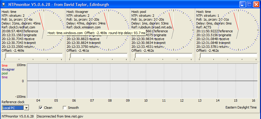
It’s widely-believed that geographic proximity is the main factor determining the accuracy of NTP. While I’m not necessarily disputing its importance, I wanted to mention some interesting tests I’ve done.

As I mentioned earlier, my (“our,” really — @ co-owns it, and keeps paying the bill without sending me his PayPal address… *g*) NTP server was incorrectly, and pretty randomly, labeled as being in Brazil, and thus set to serve time to people in Brazil and, more generally, South America. But the server is in Pennsylvania.

Surely, then, with such a long distance, quality must be terrible? I decided to measure it in reverse: I did a “mock sync” to the South American pool from my server in Texas. The command ntpdate -q servername will “sync” to a server (or set of servers) via NTP, but only show you the offset it would have applied, rather than actually adjusting your clock. I ran this on a server that’s a stratum 2 server that’s been very stable on time: when it syncs with GPS-stabilized clocks every 1024 seconds, it’s rare for it to shift the time more than 10ms. So by syncing to the South American pool, I was able to, more or less, determine the effect of the long-distance, high-latency synchronization:

oxygen ~ # ntpdate -q south-america.pool.ntp.org
server 200.192.232.8, stratum 2, offset 0.021524, delay 0.23042
server 146.83.183.179, stratum 2, offset -0.002081, delay 0.17311
server 201.84.224.130, stratum 3, offset 0.004254, delay 0.19417
26 Apr 00:33:31 ntpdate[5828]: adjust time server 146.83.183.179 offset -0.002081 sec

(First of all, no, my US server is not in that list.) You can see that it selected three servers from the South American pool, and synced to each of them. I had pings of 230ms (0.23042 seconds), 173ms, and 194ms. I had offsets of 21ms, -2ms, and 4ms. Given the three choices, ntpdate deemed the middle the most accurate, indicating that, even with almost 200ms latency crossing continents (or arbitrary divisions thereof), it could be accurate to 2ms.

NTP “subtracts” latency from the times, so that a high-latency connection won’t affect the accuracy of the time. (What does break things, though, is highly-variable, or highly-asymmetric, latency, which is pretty much impossible to “calculate.”) Still, I was surprised by just how good it was.

I then tried a test synchronization to the US pool:

oxygen ~ # ntpdate -q us.pool.ntp.org
server 66.191.139.147, stratum 2, offset 0.001096, delay 0.07080
server 65.111.164.223, stratum 2, offset -0.003190, delay 0.07475
server 66.250.45.2, stratum 3, offset 0.013041, delay 0.07225
server 63.89.76.60, stratum 2, offset 0.005535, delay 0.07397
server 209.67.219.106, stratum 3, offset 0.003419, delay 0.02605
26 Apr 00:34:36 ntpdate[6216]: adjust time server 66.191.139.147 offset 0.001096 sec

This time we got 5 servers (as is normally the case: I think the set of 3 is just given out for groups with only a handful of total servers). Four of them has pings around 70ms, and the last had a ping of 26ms. The middle server had na offset (time difference) of 13ms, but the other four were pretty close. (And when one server is “way” off, NTP disregards it anyway. Plus, it was a stratum 3 mixed in with mostly stratum 2’s, which is another count against it.) It suggested advancing my clock by 1 millisecond. (When the code is good enough to discard a 13ms difference as ‘wildly inaccurate,’ you know it’s good.)

So we have a 1ms “error” in the US, and a 2ms to South America. Africa is served by a mere 5 NTP servers. How did that go?

oxygen ~ # ntpdate -q africa.pool.ntp.org
server 41.223.43.5, stratum 2, offset 0.086558, delay 0.62405
server 196.43.1.14, stratum 3, offset 0.005741, delay 0.32759
server 196.25.1.9, stratum 2, offset -0.006428, delay 0.29601
server 196.43.1.9, stratum 2, offset -0.007126, delay 0.32123
server 196.25.1.1, stratum 2, offset -0.004245, delay 0.29314
26 Apr 00:31:07 ntpdate[4913]: adjust time server 196.25.1.1 offset -0.004245 sec

Oddly, I was served all five servers in the zone. If you look at pings, they ranges from 293ms to 624ms. That’s really bad. And the first server gave terrible time: essentially wanting to advance my clock 87ms. But again, with multiple servers present, NTP did a great job of working out the right time. It ended up trying to move my clock back 4ms.

300ms (best case) pings, going from the US to Africa, and it’s accurate to 4ms?

Some conclusions, caveats, and comments to consider:

  • “Accuracy” and “error” are really not appropriate terms. Because the server doesn’t have a time source connected directly (e.g., a GPS receiver with pulse-per-second output, a WWV receiver, or a cesium / rubidium reference recently synced to the atomic clock), the server really doesn’t know the true time. Thus we can only measure how the time differences compare. In this, I essentially just assume that my server has the accurate time, which is a dubious claim.
  • The main conclusion here is that NTP is really good at dealing with long pings. The fact that my data is crossing the ocean doesn’t really matter: it can calculate round-trip error. In light of this fact, and ignoring other information, geography is not important.
  • The server I took these measurements from sits in a data center on a nice fat backbone to lots of other providers. Thus it could be argued that it may have a much better connection that a home user might. It would be interesting to try these measurements from a normal PC on a “normal” home line.
  • Thus, my point isn’t so much that “Geography doesn’t matter” as it is, “Even if geography works against you, you can still get really good time with NTP.”

Google Charts

Have you guys seen Google Charts? It’s a quirky little API I didn’t know existed until I saw a passing allusion to it. Essentially, you pass it a specially-crafted URL (essentially the definition of an API) and it will generate a PNG image.

Here’s a fairly random line graph. My labeling of the axes makes no sense, but it was nonsensical data anyway.

One of the cooler things they support is a “map” type of chart, like this US map. The URL is a bit tricky, though this one of South America is easier to understand: chco (presumably “CHart COlor”) sets the colors, with the first being the ‘default’ color. chld lists the countries, as they should map up to the colors: UYVECO is “Uruguay,” “Venezuela,” and “Colombia.”

What has me particularly interested is that I’ve recently installed code to watch connections to my NTP servers. Here’s my Texas box, a stratum 2 server in the NTP pool (pool.ntp.org). I bumped it up to list a 10 Mbps connection speed to signal that I could handle a lot more queries than the average, although it’s still nowhere near its limit. In addition to the stats you see there, it keeps a “dump file” of every single connection. (As an aside, this strikes me as inefficient and I want to write an SQL interface to keep aggregate stats… But that’s very low-priority right now.)

Further, I have some IPGeo code I played with. More than meets the eye, actually: a separate database can give a city/state in addition to the country. (It comes from the free MaxMind GeoLite City database.) Thus I could, in theory, parse the log file created, match each IP to a state, and plot that on a US map.

This reminds me that I never posted… I set up NTP on the second server Andrew and I got, where we’re intending to consolidate everything, but haven’t had time yet. It sat unused for a while, keeping exceptionally good time. So, with Andrew’s approval, I submitted it to the NTP pool. I set the bandwidth to 3 Mbps, lower than the 10 Mbps my Texas box is at.

I was somewhat surprised to see it handling significantly more NTP queries. (They’re not online, since the box isn’t running a webserver, but for those in-the-know, ~/ntp/ntp_clients_stats | less produces the same type of output seen here.) It turns out that a flaw in the IPGeo code assigning the server to the right ‘zones’ for some reason thought our server was in Brazil. Strangely, while the United States has 550 (at last count) servers in the pool, South America has 16. Thus I got a much greater share of the traffic. It’s still low: at its peak it looks like me might use 2GB of bandwidth.

So there are a few graphs I think would be interesting:

  • A line graph of the number of clients served over time. Using Google Charts would save me from having to deal with RRDTool / MRTG.
  • A map of South American countries, colored to show which of the countries are querying the server most frequently. (The same could be done for my US server, on a state-by-state basis.)

Accuracy

I haven’t been paying too much attention to my NTP server, but some e-mails on the list about problems with the monitoring server got me to look at my server’s stats. Apparently the monitor experienced a bit of network turbulence and started considering everyone to be way off.

I was looking a bit at my local NTP stats. The last polling interval stepped my clock forward 5.024ms. This is perhaps more than I’d like; sometimes the offset is less than a millisecond.

So I started wondering what sort of accuracy this was. My server was happy with its sources, so it’s at the longest polling interval: once every 1,024 seconds, it’ll check. Thus, over 1,024 seconds, I lost 5.024ms.

Some quick calculations show that this is a 0.000491% error. I guess I’ll take it.

A Poll

Last Wednesday (the 9th), I ordered a new pair of sneakers off of eBay. (They’re new, from a trusted seller, and they’re similar to what I had previously, except not falling apart, before you think I’m too weird.)

On Friday, I started to think that they should be showing up. On Saturday, I figured it was time they’d arrive. On Monday of the next week, I was sure they’d be there. By Tuesday, I was disappointed.

On Tuesday I got an e-mail saying that they’d be shipped the next day.

Today I got an e-mail that they had been shipped.

Assuming (maybe it’s too soon to make these assumptions…) that they arrive and haven’t been damaged, what do I do about feedback? Good feedback so they won’t retaliate and leave me negative feedback? Or do I be a jerk and leave them “Neutral” feedback, saying, “Took over a week before they were shipped to me?”

Stats

For the longest time, I’ve wanted a background process that would just increment a counter with each keystroke. A friend here (who has the exact same laptop I do) commented on how it was kind of scary that all of my keys had become really shiny and worn down from use. I couldn’t even give you an order-of-magnitude guess of how many keys I’ve pressed since the life of the laptop.

But that’s all changing. A friend had sent me a link to a site called WhatPulse before. It’s essentially… a background process that counts keystrokes and also measures how far your mouse has moved. Concerned about possible privacy implications, I immediately installed it.

Here’s my profile. It’s probably quite inaccurate right now, as I didn’t install it until recently, when I did some Wikipedia cleanup, which is probably 90% clicking, and of the remaining 10% typing, about 95% of that is copying-and-pasting templates and such. So clicks are artificially high, while keystrokes are artificially low.

After a few days’ time to normalize, I want to try to extrapolate this out over the lifetime of my laptop and see where I’m at. (I have a feeling I’ll be somewhat embarassed. Speaking of which, about 5,000 pageviews on Wikipedia for me now, since whenever I last reset my Firefox profile, which was not long ago. And I’m coming on 900 edits on Wikipedia, too.)

Uhhh

I’ve been working a lot on cleaning up Wikipedia in my free time the past few days. I think I might stick with it and eventually go for admin, which seems like a fun goal. (Although as they point out, it’s no big deal really… But it’d help me a lot.) A lot of my work comes from watching the Recent Changes page, following through to suspect changes, undoing their change, and going back.

Anyway, entirely out of the blue I started to wonder if Wikipedia uses mod_gzip. So I pulled up Firefox 3’s “Page Information,” and saw the following. I felt slightly pathetic at the result. (Note that I’m sometimes on a page for less than a second, so it’s really not as bad as it seems, but still…)

How many page views?!

Running a Meeting

One thing I can’t stand is meetings where people have no sense of purpose. Today we had a group meeting for the final project for one of my classes. No one was really going anywhere with it. We discussed a few ways we could split the assignment up.

So I did something that worked even better than I expected. I took a copy of the project description and suggested that we go through each element, outline possible ideas, but with a twist: after one minute of discussion on each element, we’d have to move on to the next one.

As always happens, we’d brainstorm an idea and someone would try (perhaps inadvertently) to derail the process. Someone thought we might want to consider handling one of the events we were discussion differently. So I put his way down, too. The two somewhat contradicted each other, but they’re both on the list. Later on, someone suggested that we needed to look more into an issue before proceeding. I agreed. So I put, “Research this!!” on the list and kept moving.

Not ten minutes later, we had an outline of the whole project. Very rough, mind you. But I’m pleased, because in the twenty minutes before that, we’d essentially each sat around staring into our computers, making a halfhearted attempt to think of how to split up the project. Now we had an outline of the whole thing.

What’s most awesome, though, is that this way of thinking ended up being contagious. We got through the outline, and it was time to split the assignment up. And this time, instead of a theoretical discussion about all the possibly ways we could divvy up the work, someone got up and put a list of the sections on the board, and we rapid-fire split them up. No discussion of, “Well, I think those two sections might go well together given the current alignment of the planets…” He just took two sections and assigned them to someone.

I don’t profess to be the best meeting-runner of all time, but why can’t more people run meetings this way? A meeting should be a place where people come together to share ideas before going their separate ways to work on individual sections. So focus on the parts that affect everyone, and leave the individuals to handle the mundane details.

And this is what I think is so neat about management. You’d expect a management major to be a heavy-handed leader. But the secret is to be an invisible catalyst helping things run smoothly. Done right, you needn’t even be recognized as a leader.